Big news! Check out our new look!
The past few months, the Ohio Dental Association has been working on our look which includes our new website and a refreshed logo with brand new colors for each of our departments.
Our goal when selecting each of these unique colors was to maintain the ODA brand while clearly identifying each department and the services it offers our members. Based on research we gathered when deciding on our refresh, we found that 90% of judgments are made on a brand based solely on color.
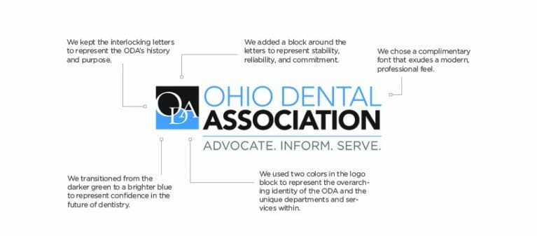
When creating our refreshed logo, we kept the interlocking letters to represent our history and purpose moving forward. Around those letters is a block that is meant to show our stability, reliability, and commitment to all of you. Our updated font choice was meant to reflect a modern and professional feel, showing that dentistry is always on the cutting edge.
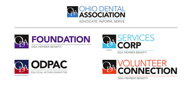
The overarching blue color you can find in the ODA logo was chosen because blue is thought to represent trustworthiness and confidence, two things we hope you recognize in our organization. OhioDDS and the ODA Services Corp. also utilize a blue color, although in a lighter shade, to represent the same qualities.
Each of our department logos stems from the same template with the specific color and name inputted. Our Annual Session logo is green, which is meant to make individuals feel serene and healthy. We thought this would be a perfect representation for our event where dentists from all over can come together and discuss the health of their patients, staff, and community. Our ODCAST logo is also green!
The ODA Volunteer Connection was created with an orange hue, a color that combines optimism with playfulness and exuberance. The ODA Foundation is composed of purple, which is meant to give a sophisticated feel.
Finally, the logo for ODPAC, our Political Action Committee, is formed with both blue and red. Again, blue represents confidence and trustworthiness. The color red evokes a passion and grabs the attention of viewers. Both of these colors together excellently summarize our mission when it comes to having our voices heard.
We hope you’re as excited for our refreshed logo as we are. Every aspect has been thoughtfully curated and interlaced so that all of our members experience a fully compatible brand.
The brand refresh and new website have been overseen by the ODA’s Website Working Group, which was appointed by the ODA Council on Membership Services in 2018.